
 English
  Français
  Español
  Deutsch
  Português
  Italiano
  العربية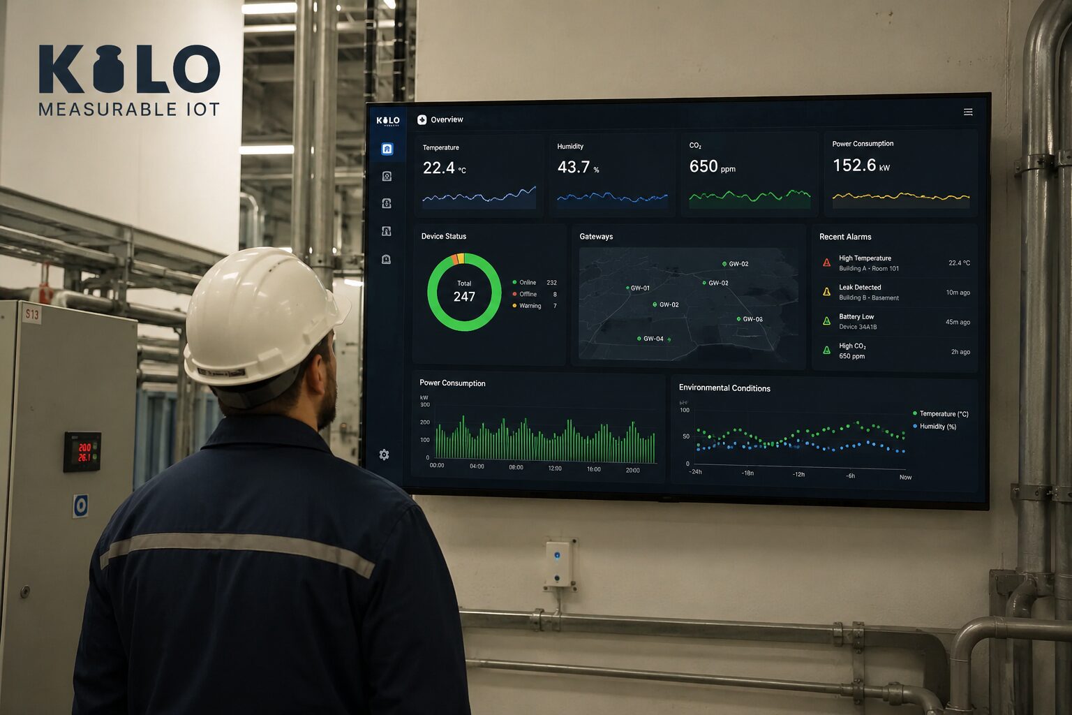
A thousand sensors reporting every minute produce more than a million readings a day — and not one of them is useful sitting in a database. IoT data visualization is the discipline of turning that raw telemetry into dashboards, maps, and site views that let a human decide something in seconds: is the cold room fine, which building is burning energy, where is the leak. This guide covers what good IoT visualization looks like, the building blocks to demand from any platform, and how to choose an IoT visualization platform without regretting it six months in.
Why Do You Need an IoT Dashboard, Not Just Raw Data?
The gap between "we collect sensor data" and "we act on sensor data" is almost always a visualization gap. A CSV export answers questions a day late; a live dashboard answers them at a glance. Good IoT data visualization does three jobs at once: it shows the current state (is everything within range right now?), it exposes trends (is this compressor drawing more current every week?), and it directs attention (of my 400 devices, which three need a human today?).
That last job matters most. The purpose of a dashboard is not to be watched — it is to make the exceptional obvious. Visualization and alerting are two halves of the same system: the dashboard shows context, the alert brings you to it.
The building blocks of IoT dashboards
Whatever platform you evaluate, these are the widgets and views that do the real work:
Time-series charts — the workhorse. Temperature, humidity, energy, level, vibration: nearly every sensor value earns a line chart with sensible time ranges and comparison across devices.
Gauges and status tiles — current-state at a glance, with thresholds baked in. A wall of green tiles that turns red exactly where the problem is beats any table.
Maps — for anything distributed: GPS trackers, city-wide sensors, multi-site estates. Live position and status on one map replaces a fleet spreadsheet.
Tables and alarm lists — sortable truth for operators: last value, last seen, battery, signal quality. The unglamorous view your technicians will use daily.
Historical trends — zoom from the last hour to the last year. This is where predictive maintenance starts: patterns behind recurring failures are only visible in the long view.
What Is a 3D Digital Building Twin?
The newest step in IoT visualization is spatial. Instead of a grid of charts, a digital building twin renders the building itself — floors, rooms, equipment — with live sensor values bound to their physical locations. Walk a facility manager through a 3D view where the overheating server room glows red, and the data explains itself; no legend required.
Kilo's dashboards include a 3D digital building twin with a built-in editor: draw the building or import a DXF floor plan, place objects from a 60+ item catalog, and bind live sensors to them. For multi-site operations it turns "which sensor ID is that?" into "third floor, north wing, above the loading dock."
Real-time or historical? You need both
Real-time visualization runs operations: current values, live alarm states, the last few hours of movement. Historical visualization runs improvement: seasonal load curves, degradation trends, before/after proof that a fix worked. When evaluating platforms, check both directions — how fresh is "live" (seconds or minutes?), and how long is history retained at what resolution and cost? Platforms that meter historical data points can make the long view surprisingly expensive.
How Do You Choose an IoT Visualization Platform?
The dashboard specialists — Ubidots and Datacake are the strongest — offer polished widgets and fast setup, and they are genuinely good at it: we say so plainly in our Kilo vs Ubidots and Kilo vs Datacake comparisons. Grafana is the open-source power tool: unbeatable flexibility if your team enjoys wiring data sources and maintaining it. The trade-off to watch with visualization-first tools is what happens before the chart: if the platform has no built-in connectivity, you still need a separate LoRaWAN network server, broker, or pipeline to get sensor data in.
That is the case for an integrated platform: on the Kilo IoT platform, the LoRaWAN and mioty network servers, device management, visual rules, alarms, and the dashboards are one product. Data lands in a normalized device model and is immediately chartable — no pipeline between the sensor and the chart, and an AI assistant that builds dashboards and rules with you. IoT data visualization is a feature of the platform, not a second subscription.
A quick checklist for the decision: widget breadth (charts, gauges, maps, tables), site-level views (floor plans or a 3D twin), history depth and its pricing, alert integration (click from alarm to context), sharing (read-only dashboards for management or customers), and where the data comes from (built-in connectivity vs bring-your-own pipeline).
How Do You Try an IoT Dashboard With Your Own Data?
The honest test of any IoT visualization platform is your data on its dashboards. Kilo's free tier — 5 devices, commercial use allowed — includes the full dashboard suite and the built-in network server, so a gateway and a couple of sensors are enough to judge it this afternoon. Start with the dashboards tour, then put a real sensor on a real chart.